@schizoidman@lemm.ee to World News@lemmy.mlEnglish • 4 months agoChina’s Xi Jinping asked ‘What’s so bad about deflation?’ amid economic slowdown, report saysfortune.comexternal-linkmessage-square70fedilinkarrow-up1116arrow-down15cross-posted to: world@lemmy.world
arrow-up1111arrow-down1external-linkChina’s Xi Jinping asked ‘What’s so bad about deflation?’ amid economic slowdown, report saysfortune.com@schizoidman@lemm.ee to World News@lemmy.mlEnglish • 4 months agomessage-square70fedilinkcross-posted to: world@lemmy.world
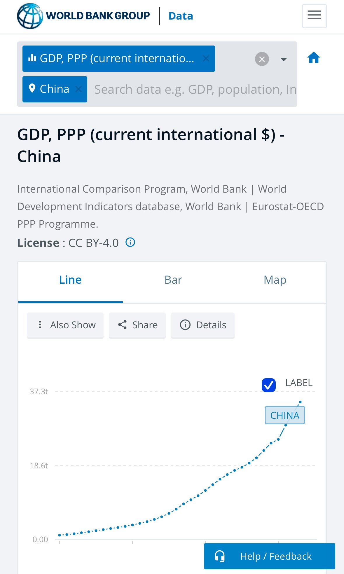
minus-square@scarabic@lemmy.worldlinkfedilinkEnglish1•4 months agoLine go up. But that appears to be a GDP graph, not a chart of purchasing power. Am I missing something?
minus-squareCowbee [he/they]linkfedilink2•4 months agoThis is adjusted for PPP, Purchasing Power Parity.