

You must log in or register to comment.
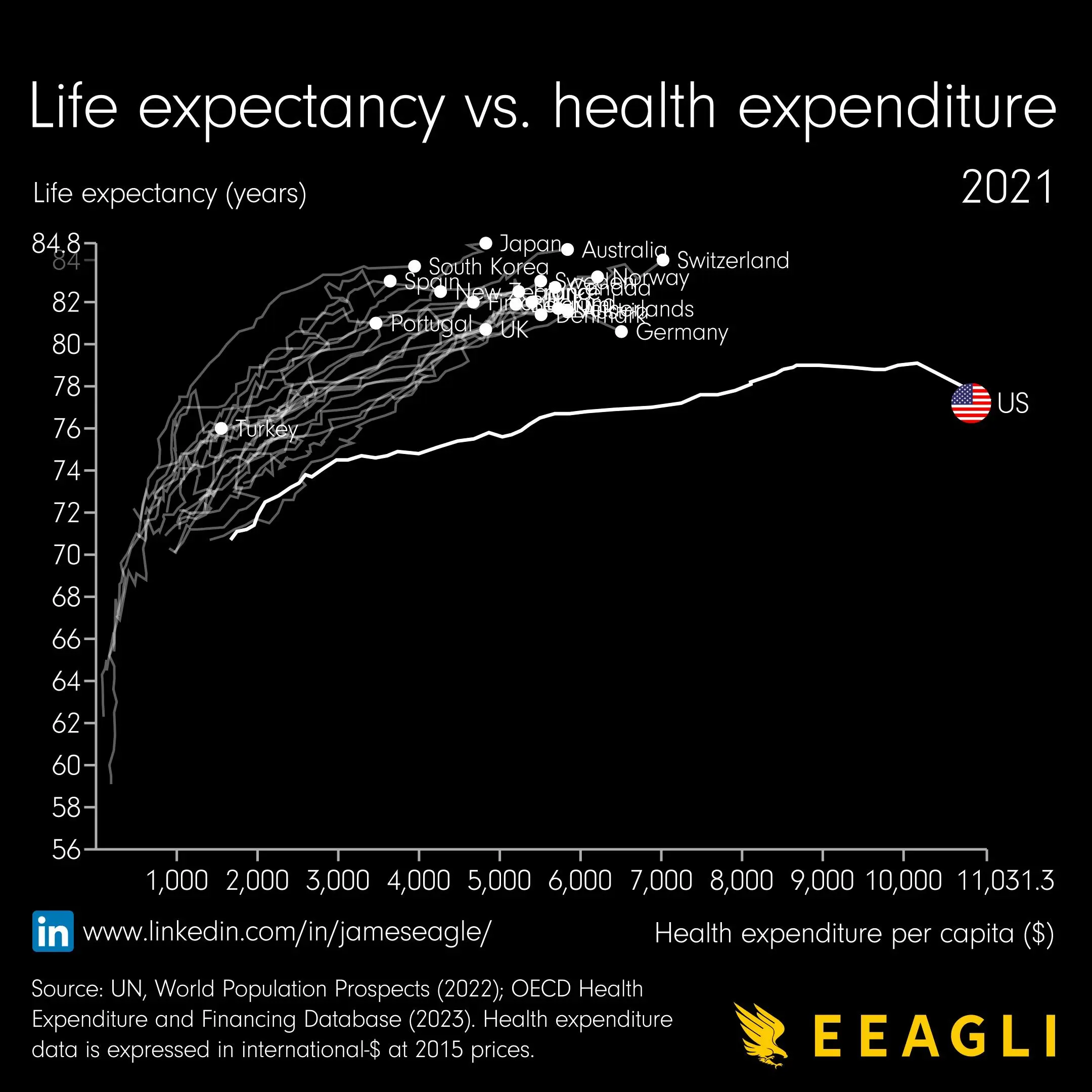
I would really like to know how this graph was generated, because some expenditure per capita values have three different corresponding life expectancy values. Just look at Spain for example.
I assumed each line represents time, so Spain’s values fluctuated some
